
As the web designer on the project doubling as a content strategist, I helped develop the concept from a mere blog post (inspired by Vanderbilt University's equivalent) into a microsite acting as a welcoming gateway to the Duke community.
Launched in late March 2015 after admissions decisions were announced, the site reached an audience of over 5,000, with 30,000+ page views within two weeks. The project lives on today and my original site work and content have been maintained for the last few years. Browse the website at digitalswag.duke.edu.
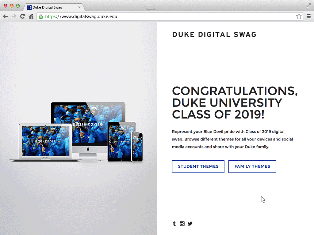
From Blog Post to Gallery
My goal was to improve on Vanderbilt's model, in which content is listed by size/device on a long scrolling page within their admissions site. Organizing by theme in a gallery format allowed users to more easily browse and understand the site content. This choice also created the opportunity for us to better showcase different aspects of the Duke community to help incoming students learn more about the university and envision themselves at Duke.