

At Capriza, our mission is to simplify life at work through mobility. We help our customers empower their employees through micro apps for work.
My Role
I led the design of Capriza’s Universal Micro Apps from the start of the project in April 2016. We launched a total of 27 micro app templates for key uses across Sales, Field Services, and Employee Self Service categories before I left in July 2017. At the time, refinements of existing templates were in development, with no new templates planned.
The core team on this project consisted of myself, the Director of Product Management and the Technical Content Lead. I worked with a remote team of engineers to develop new mobile features for the templates and partnered with Quality Assurance to define evaluation guidelines.
I presented concepts and prototypes to executives and stakeholders across departments to gain support and gather feedback throughout the course of the project. Additionally, I collaborated with Customer Success and the Community Lead to deepen customer engagement with new content and develop feedback channels. I also wrote support articles for the Help Center to help customers get the most from templates.
I worked on the template building experience until October 2016, when we brought in a new designer to continue my work. For this side of the project, I worked with the same core team alongside the VP of Research & Development and 4-5 senior developers.
But first, what’s a micro app?

Micro apps are embedded in our app WorkSimple.
Think a mobile app, but with a fraction of the functionality. Each micro app is a single workflow extracted from a legacy work application; just the good stuff to get the job done. So just the critical info to make an approval decision, not the entire enterprise resource planning platform it’s buried inside. Just a way to upload receipts from your phone, not the 5+ step billable expense flow and its dozens of inputs.

To the user, it’s a bite-sized workflow. Behind the scenes, we map micro app interactions back to the source system, inheriting business logic and behavior. Our ability to cut through the clutter of these legacy enterprise systems allows us to completely transform the user experience.

THE CHALLENGE
By late spring 2016, our efforts to help customers build and launch micro apps were paying off. The volume of micro apps going live were at an all time high, but adoption and usage were often low. Customers were building micro apps that might work functionally but still weren’t working well for users.
Introducing the Amobination
That’s my term for a mobile abomination. Micro app issues came in all sorts of flavors:

The Elephant on an iPhone
A heavyweight with terrible performance. The entire source application was moved over, overloading the main flow with auxiliary functionality.

The Decision Paralyzer
All the options, but no clear call to action. Comprehensiveness was chosen over intentionality at the expense of clarity and usability.

The Techno-Autocrat
A harsh, punishing interface. Technical, unfriendly language from the source system was inherited.
Despite enormous potential for improvement, the end product was often landing at a mark somewhere above mobile and short of usable. Somehow, mobilization was coming at the expense of simplification, and focused workflows were losing out to the system.

A Return to Simplification
At a high level, our goal was to get back to our mission: to simplify complexity. The question at the center of this project for me was this:
How can we help customers achieve better experiences for employees?
THE DISCOVERY
I partnered with the PM and Tech Lead to gather insights and data points. We reached out to business owners, IT project leads, partners, and our customer success team, and reviewed our current customer base and micro apps in production and development.
Here are the insights that drove our project forward:
✍️ A blank page begs to be filled.
In our product, micro app builders began with a blank mobile page and the source application side by side. The temptation to go hyperlink happy was unabated by a tool touting technical features over what to build. As a result, we spent a lot of time urging customers to get rid of stuff that shouldn’t have been there in the first place.
🤷♂️ We can’t expect customers to be designers.
Our customers building micro apps were largely IT folks or business owners with ranging technical expertise. Having a rich mobile UI library didn’t mean customers would know how to use it, and that wasn’t the their fault but a gap in the product experience.
🌀 We’re constantly reinventing the wheel.
By that time, we’d helped customers build hundreds of micro apps, serving hundreds of thousands of users. (We hit a million runs a month shortly after). We’d slowly built up a vast body of knowledge and expertise as to what worked and why, yet we regularly saw the same use cases and source systems executed poorly.
THE SOLUTION
Capriza’s Universal Micro Apps are templatized workflows for mobile, designed to share our deep understanding of common use cases, source applications, and mobile user experience design with customers.

From Platform to Content
Customers can browse a library of 27 high-impact use cases across various categories to start with. Customers begin with a use case specific micro app rather than a blank slate.

We design, you connect
Micro app templates are preconfigured with best practices for the use case. Pages, flows, UI, styling, notifications, event tracking and more are built in. All the customer has to do is connect these virtual components to real controls on the source system.

Mobile First and Agile
The mobile experience is optimized but flexible. Customers can adapt the template to fit the unique needs of any source application.
THE JOURNEY
As far as user stories went, this was a boulder in the product roadmap. As constraints around our architecture became more clear, we opted for an incremental approach to the underlying technology while concurrently releasing templates, in favor of pushing forward the content agenda.
Outnumbered and apart from the remote engineering team, Product struggled to prioritize user needs among technical discussions. Platform solutions would define the template building experience before content was fully developed.
THE TEMPLATE BUILDING EXPERIENCE
Before I could design the template content itself, we first needed to define what a template was, how the customer would work with the template, and how it would work with our technology.
Establishing this foundation for templates was my first design challenge, which I took forward by sharing early concepts widely with internal teams for feedback, and iterating rapidly with interactive prototypes. I continued this work until October 2016, when we brought in a new UX designer to take over the template building side so I could shift to lead the mobile experience fully. The following design discussions are my own contributions up until then.
Modular Thinking
We started by breaking down our idea of the finished template into layers of components: a layer of alerts for end users and another layer of event tracking for customers. The use case was made up of pages made up of mobile controls, then preset styles, and finally properties.
Our first concept for the template building experience included branches of options at each level to meet variation in use cases and source applications: use case templates for different source applications, page templates, layout variations for page types, style themes and more. This turned out to be hugely ambitious from an engineering perspective. We pushed the source application and page template concepts to a later date but tackled style consistency across templates gradually.

Connecting the Pages
One of the questions central to our template journey was: How might we create thoughtful content tailored to common use cases and source systems that allow flexibility and customization?
We considered a host of directions: including automation pages for specific source applications, creating pages on the fly as the user connected new flows, and using page templates for automation pages, among others. In the end we prioritized clean template content, while allowing the user to add, edit, and delete pages (and page content) in an easy way. Instead of locking users into a connection between pages, we decided to suggest the next page so the user could always insert any extra automations along the way.

Indicator Overload
Templates provided users with virtual mobile content to start with: pages, connections, and controls. Our existing platform, which depends on the source system, did not handle this so gracefully. It flagged a lot of errors: unconnected controls, controls missing page connections, virtual controls, and ‘phantom’ controls it couldn’t find on the web. This resulted in a minefield of visual indicators impossible to understand, penalizing the user before they had even started.
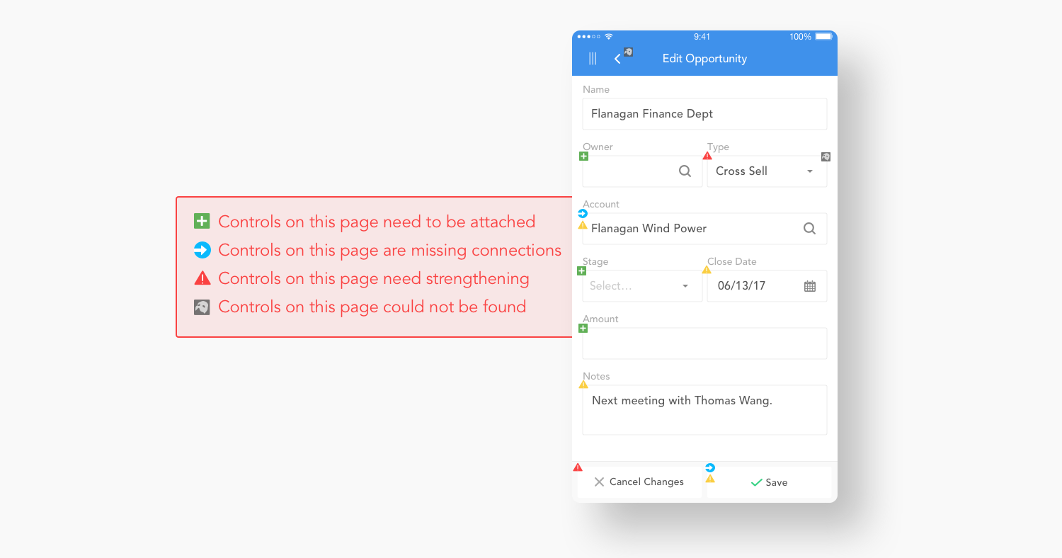
To combat this overload, I designed a hierarchy to direct users’ attention to what needed to be done first. We explored a few directions and eventually came to the conclusion that more icons and changes to existing icons missed the point. My final concept emphasized which controls needed to be connected, the first step.

Flipping the Paradigm
When building a micro app from scratch, the user would first designate the web control type and then select the actual web control from the source application. The user could then change the mobile display UI as desired. A common mistake was that users would try to grab the web control as the display type they wanted for the mobile experience, causing identification issues for our engine.


Templates flipped the process to reduce that error. We provided the mobile UI, which could then map back to different kinds of web controls. We needed the user to tell us what kind of web control to look for before they could successfully connect it. Our challenge was now to direct the user back to the web.


This fundamental change to micro app creation necessitated some form of messaging to guide the user through the steps. In our design we sought to strike a balance between guidance and intrusion. This was the source of endless debate as I prototyped possible directions:


We came up with a wizard experience that allowed the user to manage all the template controls that needed to be connected. For each mobile control, the user would work through a short series of steps facilitated by messages. The user could skip around if desired, pause the process, and exit back to the normal freeform creation mode at any time.
Watch below for a clickthrough of my Invision prototype:

THE MOBILE EXPERIENCE
See the Timesheet Template case study for a deep dive into the development of a single micro app template.
Guiding Principles
Our approach was to design to fit 80% of source applications, and build in flexibility for the remaining 20%. We let the use case drive mobile feature development and then trickle into platform development. The following principles guided me throughout the design of each template:

The Process

For each template, we began with consolidation and analysis of our knowledge of the use case across many source applications. We talked to customers, partners, and business users to understand the gap between how these workflows are usually structured on source applications and how they should work in users' minds. From those data points and user requirements, I created concepts, wireframes, interactive prototypes, and detailed design specs for the mobile experience. These designs were then vetted over many iterations with Product, Research & Development, and key customers.
As we refined the design, I worked closely with engineering to define and develop any new mobile UI components necessary. I partnered with fellow UX Designer Shahar Ben-Ari, who owned the template building experience, to ensure that the template content aligned with our building tool. Once the new features were complete, I built out the template pages and flows using our tool and handed it off to R&D to finish up advanced configurations. Finally, I partnered with the Quality Assurance team to conduct heuristic evaluations, task scenario testing, and UI inspections before shipping the template.
We worked in some time each release to gather feedback and monitor success of live templates to incorporate refinements.
The Templates
We began the mobile content journey with a suite of 6 approvals templates. These were high impact use cases (40% of our customers have rolled out at least one approval micro app) with simple workflows.
After releasing approvals templates in September 2016, we debated about going deep into approvals or wide across other use cases. I worked with the core team to create two source application-specific approvals templates: one for SAP and another for Peoplesoft. As our business focus broadened across other line segments, we shifted our attention to Employee Self Service, Field Service, and Sales use cases.
We released templates in the following schedule:
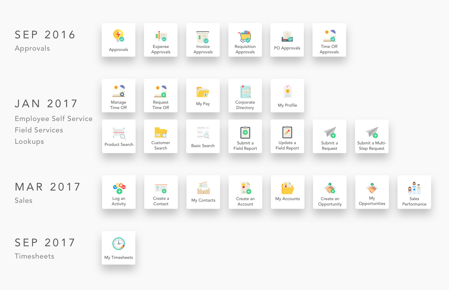
The Timesheet Template was our last use case in the road map because it was high impact, but also high effort.
THE IMPACT
As of February 2018, 50 of 140 production micro apps built in 2017 are template based, serving about 5000 users across 20 customers.
“Many business users don’t have the design savvy to create a user-friendly yet functional layout. Templates reduce the most time-consuming part of the build process and eliminate the chance of a perfectly functioning application failing in adoption simply due to poor design.”
“Templates speed up the micro app creation process by cutting off discussions about what should be included and how it should be displayed, which spares us a couple of weeks worth of meetings and discussions with business owners.”
Reflections
What can be hacked will stay hacked without a compelling case.
We knew from the start that our mobile library was long overdue for a facelift, and that the UI and visual design of templates were a significant gain for customers. However, we didn’t have time for a full cycle of UI tweaks and went with the workaround: hard coding the changes into templates. This proved extremely painful to undo when we finally updated our defaults. Lesson learned: put forth the upfront effort to understand and share the potential impact. It would have been worth shifting priorities slightly so that later down the line we didn't have to pull double duty to fix it.
Un-training users can be harder than training them from scratch.
Shifting the mental model of our platform was met with resistance until we were able to share the entire vision and show how it simplified the building process. It took a long time to gain that buy in internally, but having our Customer Success team bring it to customers was even more difficult. To aid this effort, I began discussions with our Training Lead about how to incorporate templates into our customer training process.
This project is the culmination of the product and use case expertise I gained at Capriza. I’m really proud of this project because of the value it brought not just to end users, but the business as well. It gave time back to IT customers and our Customer Success team, improved and pushed forward the usability of our complex tools, and ultimately resulted in a much more streamlined user experience for the end user.